

 1 month ago
20
1 month ago
20
PROTECT YOURSELF with Orgo-Life® QUANTUM TECHNOLOGY
Orgo-Life the new way to the future Advertising by AdpathwayEver feel like your dashboard keeps growing while your answers get worse? That is exactly how most teams end up missing the one saas metric that actually tells them whether the business model works.
You can open Table of Contents show
I have seen this happen in real operating reviews. Revenue looks fine, signups look busy, and then churn or payback quietly wrecks the month.
The fix is simpler than most founders expect.
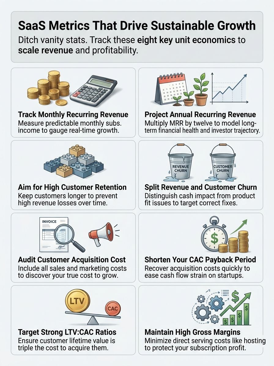
I use one metric at the center, net revenue retention, then I support it with a small set of numbers that explain why it moved: MRR, CAC, CLV, gross margin, and product engagement. I am going to walk you through the exact dashboard logic I use, plus the benchmarks and formulas that make these metrics matter in a US SaaS business.
Read on.
The Core SaaS Metric SaaS Teams Must Prioritize
If I had to pick one key metric for a subscription business, I would choose net revenue retention. It tells me whether existing customers are expanding fast enough to offset downgrades and churn, which makes it the clearest read on product value, pricing power, and customer success.
That does not mean the other metrics go away. It means they become supporting metrics instead of dashboard clutter.
- MRR shows current recurring revenue and short-term momentum.
- CAC shows what growth costs.
- CLV shows how much economic value a customer creates.
- Gross margin shows whether revenue turns into usable cash.
- Customer churn and retention show whether customers stay long enough for the model to work.
In the 2025 SaaS Capital survey of more than 1,000 private B2B SaaS companies, companies with the highest NRR posted median growth that was 83% higher than the population median. That is why I treat NRR as the heartbeat of SaaS unit economics, not just another retention line in a deck.
A clean dashboard usually needs three systems working together: a CRM such as HubSpot or Salesforce for pipeline data, a billing source such as Stripe for recurring revenue, and a BI layer such as Tableau, Looker Studio, or a warehouse model for cohort reporting. If those numbers do not reconcile weekly, the dashboard will lie to you.

The real job of a SaaS dashboard is not to show more numbers. It is to help me see which number changed, why it changed, and which team owns the fix.
I also like a simple review cadence. Daily for major MRR changes, weekly for funnel and churn signals, monthly for board-level unit economics.
Revenue Metrics That Drive Growth

I focus first on MRR and ARR because they tell me whether recurring revenue is real, durable, and increasing for the right reasons. In a SaaS business, top-line growth without retention discipline can fool you for months.
The 2025 SaaS Capital benchmark report put the median year-over-year growth rate for private B2B SaaS companies at 25%, down from 30% in 2023. That gap matters because it means efficient recurring revenue has become more valuable than noisy growth.
Monthly Recurring Revenue (MRR)
MRR shows predictable monthly subscription revenue. I calculate it from active subscription value, then split changes into new business, expansion, contraction, reactivation, and churn so I can see what actually moved the number.
That split is more useful than one headline MRR total. If MRR grows because expansion is strong, I keep leaning into customer success and pricing. If MRR grows only because new logos are masking churn, I know the model is weaker than it looks.
- New MRR: revenue from new customers.
- Expansion MRR: upgrades, seat growth, or add-ons from existing customers.
- Contraction MRR: downgrades or reduced usage.
- Churned MRR: revenue lost from cancellations.
MRR belongs on every weekly dashboard because it is the fastest clean read on recurring revenue health. I also compare MRR growth to cash collected, because a business can look healthy on bookings while collections lag behind.
Annual Recurring Revenue (ARR)
ARR is the annualized view of recurring revenue, and it is the right metric for planning, hiring, and investor conversations. The simple version is MRR multiplied by 12, but I only use that shortcut when the underlying MRR is stable and the contracts are truly recurring.
ARR becomes far more useful when I segment it. I want to know ARR by product line, customer size, acquisition channel, and cohort age. That tells me whether growth comes from a repeatable motion or from a few oversized deals.
A quick rule I use with founders is this: if ARR is rising but expansion ARR is flat, pricing power is probably weaker than the headline chart suggests. That usually points me back to onboarding, packaging, or sales qualification.
Retention Metrics That Ensure Long-Term Success
This is the section I never rush. Retention metrics decide whether a SaaS company compounds or leaks.
The 2025 High Alpha SaaS Benchmarks Report showed retention targets clustering around 90% across ARR bands, which is a useful baseline for founders who are still guessing what “healthy” looks like. I treat that as a starting point, then I segment hard by ACV, use case, and onboarding path.
Customer Retention Rate
Customer retention rate shows how many customers you kept over a period. The formula is simple: [(Customers at end of period – new customers) / customers at start of period] x 100.
I care less about the single company-wide percentage and more about cohort shape. If one onboarding path holds 90-day retention at 80% and another sits at 64%, that is not a reporting problem. That is an operating problem with a clear fix.
One pattern I trust is a weekly cohort review tied to onboarding milestones. If users fail to hit one clear activation event, such as importing data, inviting teammates, or publishing a first workflow, retention usually weakens before churn shows up in billing.
Revenue Churn vs Customer Churn
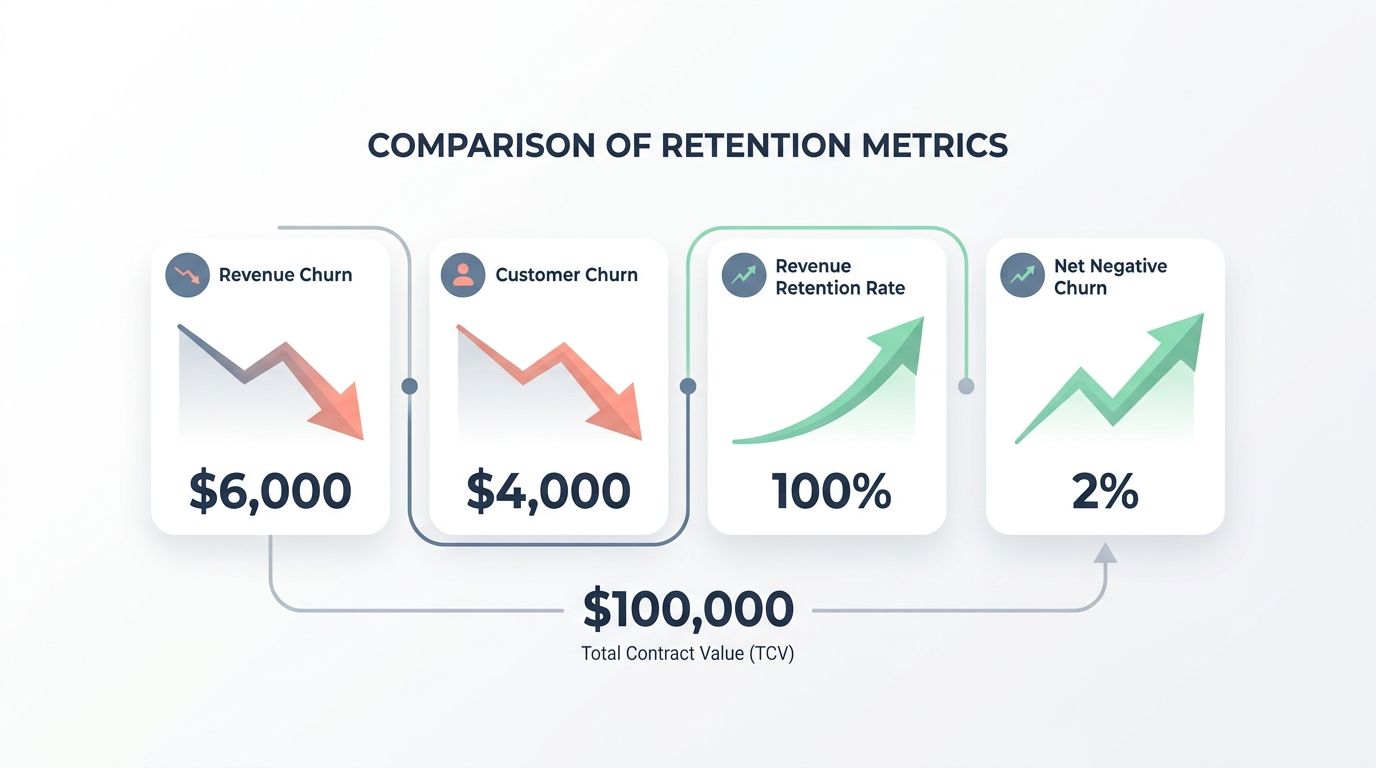
I split revenue churn and customer churn in reporting every single week because they answer different questions. Customer churn tells me whether accounts are leaving. Revenue churn tells me how much damage those exits and downgrades actually caused.
| Revenue Churn | Lost MRR from cancellations and downgrades, shown as a percent. | Shows cash impact fast and exposes forecast risk. | Compare churned and downgraded MRR against starting MRR, then factor in expansion revenue. | Starting MRR $100,000, churned $6,000, downgrades $4,000, expansion $10,000, net retention lands at 100%. | ChartMogul, ProfitWell Metrics, Stripe reporting |
| Customer Churn | Lost accounts over a period, shown as a percent. | Reveals product fit, onboarding gaps, and weak qualification. | (Number of customers lost / customers at period start) x 100. | Start with 1,000 accounts, lose 20, churn = 2% for the month. | Mixpanel, HubSpot CRM, Baremetrics |
| Revenue Retention Rate | Net recurring revenue kept after downgrades, churn, and expansion. | Shows whether the installed base is compounding. | Track starting MRR, lost MRR, downgrade MRR, and expansion MRR side by side. | Expansion outpaces churn, so revenue still grows even if a few accounts leave. | ProfitWell Metrics, ChartMogul, internal SQL |
| Net Negative Churn | Expansion revenue exceeds lost revenue. | Signals efficient growth without relying only on new sales. | Compare expansion MRR to churned plus downgraded MRR monthly. | Expansion $12,000 and churn plus downgrades $8,000 means the base still grew. | Stripe, ChartMogul, Looker |
| Why track both | Revenue and account views surface different problems. | One catches pricing and expansion issues, the other catches fit and support issues. | Review the two metrics together every week and drill into spikes. | Losing many tiny accounts may not hurt revenue much, while one large churn event can break a forecast. | Google Sheets, Mode, Looker Studio |
| Actionable signals | What to do when each moves. | Turns reporting into operations. | High revenue churn calls for pricing and renewal review. High customer churn calls for onboarding and UX review. | A contract change for one large account can save more MRR than a month of small-funnel optimization. | Zendesk, Intercom, Amplitude |
| Timing | Cadence for checks and alerts. | Monthly reviews catch trends, and alerts catch sudden losses. | Track monthly and trigger alerts for any defined MRR-loss threshold. | A single large cancellation should create an immediate response plan, not wait for month-end. | Slack alerts, Stripe webhooks, BI alerts |
Stripe’s 2025 benchmark report on vertical and SMB SaaS showed that stronger workflow-owning categories posted net revenue retention in roughly the 102% to 112% range, with gross retention near 89% to 96%. That is a practical reminder that stickiness grows when your product sits in a core workflow, not at the edge of it.
For most teams, the fastest retention wins come from four fixes:
- tighten ICP qualification before the sale,
- define one activation event in the first 14 days,
- review downgrades separately from full churn,
- assign renewal outreach earlier for high-MRR accounts.
Acquisition Metrics That Fuel Scalability
I watch CAC and CAC payback closely because growth gets expensive faster than most dashboards admit. A bad acquisition engine can hide behind rising revenue for a long time.
Customer Acquisition Cost (CAC)
CAC should include every sales and marketing expense tied to winning a new customer: salaries, commissions, paid media, software, contractors, events, and agency fees. If those costs live in different systems and you do not reconcile them monthly, CAC will look better than reality.
I calculate CAC by channel and by segment, not just company-wide. Paid search CAC for SMB may look healthy while enterprise outbound CAC is quietly absorbing too much sales time and too many implementation promises.
The official Stripe SaaS CAC guide also pushes teams to benchmark CAC in context, which is exactly right. A CAC number means almost nothing until you compare it with contract size, margin, sales cycle, and retention.
CAC Payback Period
CAC payback period measures how many months it takes to recover acquisition cost from gross profit generated by the customer. I prefer using gross margin-adjusted MRR, not raw MRR, because that gives me a cleaner cash view.
Here is the formula I use: CAC / (monthly recurring revenue per customer x gross margin). If CAC is $5,000, MRR is $500, and gross margin is 80%, payback is 12.5 months.
That one number changes decision-making fast. A channel with strong lead volume but a 20-month payback can choke cash. A channel with lower volume and a 6-month payback can fund the next stage of growth.
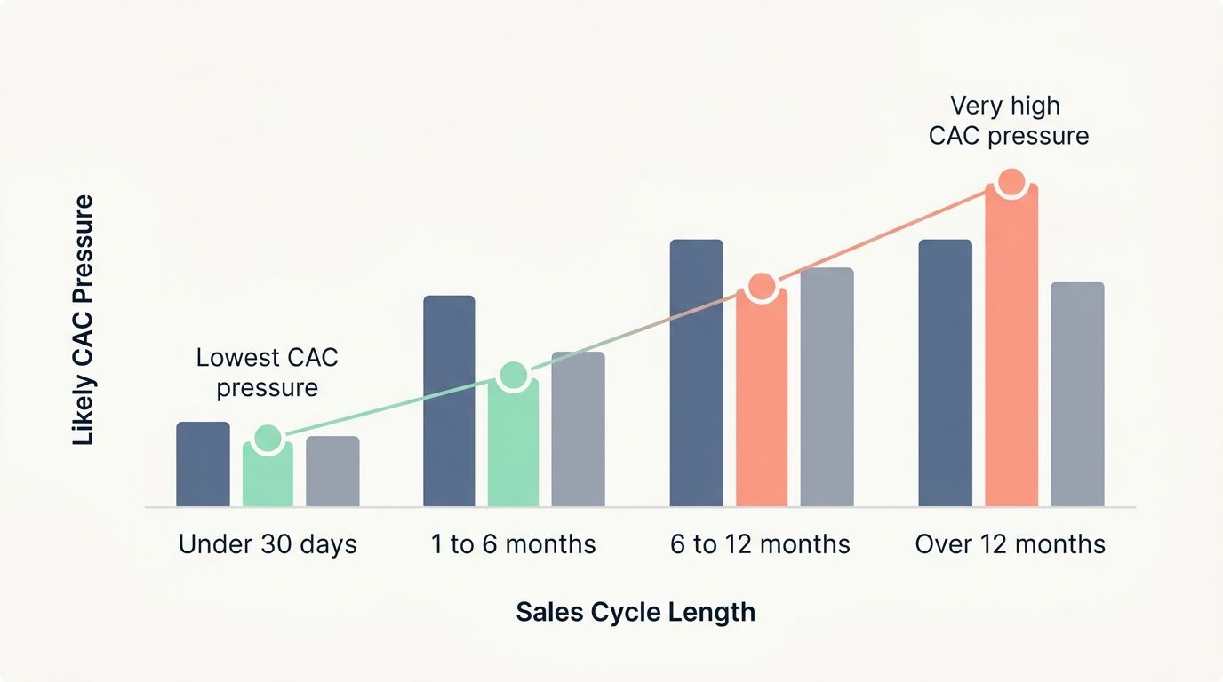
| Under 30 days | Simple purchase, lower sales touch, faster proof of value | Lowest CAC pressure | Protect activation and automate follow-up |
| 1 to 6 months | More stakeholders and more demos | Moderate CAC pressure | Audit qualification and demo-to-close rate |
| 6 to 12 months | Security review, procurement, and implementation friction | High CAC pressure | Require stronger ACV and clearer expansion path |
| Over 12 months | Enterprise complexity and heavy sales effort | Very high CAC pressure | Track payback by segment before scaling headcount |
In Stripe’s 2025 vertical SaaS benchmark data, companies with sales cycles under 30 days showed median CAC near $1,250, while cycles longer than 12 months were closer to $15,500. That is why I never discuss CAC without discussing sales cycle length in the same meeting.
Lifetime Value Metrics That Reflect Profitability
Lifetime value metrics tell me whether acquisition spend will ever come back with enough margin left over to matter. This is where a lot of growth stories either hold up or fall apart.
Customer Lifetime Value (CLV)
CLV measures the value a customer generates during the relationship. A common SaaS shortcut is ARPU / churn rate, though I prefer margin-adjusted CLV when I am making budget calls.
For example, a customer paying $1,000 per month with 5% monthly churn has a simple revenue CLV of $20,000. If gross margin is 75%, the economic value is lower, which is why margin belongs in serious unit economics conversations.
CLV becomes much more useful when you calculate it by segment. Enterprise, mid-market, and self-serve users often have completely different onboarding costs, expansion behavior, and support load.
The LTV to CAC Ratio
LTV to CAC ratio tells me whether each customer is worth the cost to acquire them. Stripe’s SaaS CAC guidance says SaaS businesses generally aim for a 3:1 LTV:CAC ratio, and that remains a solid planning benchmark for most US operators.
I do not stop at the headline ratio, though. A 4:1 ratio can still hide a cash problem if payback is too slow. A 2.5:1 ratio can be workable for a short-payback, low-churn motion that is still early in its upsell story.
- Below 1:1: the model is losing money on acquisition.
- Around 3:1: healthy for many SaaS companies.
- Above 5:1: efficient, but it can also mean you are under-investing in growth.
My rule is simple. I review LTV:CAC next to payback, gross margin, and retention. Looking at the ratio alone is how teams talk themselves into bad scaling decisions.
Efficiency Metrics for Financial Health
Efficiency metrics tell me whether recurring revenue is turning into durable economics. This is where the subscription business model proves itself.
Gross Margin
Gross margin measures revenue left after direct costs such as hosting, support, and third-party usage fees. For AI-heavy products, this now includes inference and model costs that many teams still bury too deep in the P&L.
The 2026 SEG SaaS report showed median gross margin reaching 73.5% in the highest revenue-multiple cohort, while the 2025 High Alpha report noted that larger SaaS companies held gross margins near 80% even as early-stage companies saw margin pressure. That tells me two things: healthy margins still matter to investors, and compute or service creep can punish early-stage teams fast.
If gross margin drops below target, I check four places first:
- cloud and storage usage by customer segment,
- support intensity for low-ACV accounts,
- overuse of third-party APIs or data vendors,
- pricing tiers that fail to capture high-usage customers.
Contribution Margin
Contribution margin shows the incremental profit left after variable costs for a customer, channel, or product line. It is one of the best ways to catch growth that looks good in ARR but does not create enough money to fund scale.
I like contribution margin because it forces harder questions. Which segment consumes the most support time? Which add-on increases revenue without much delivery cost? Which customer cohort looks healthy on MRR but weak on service burden?
If gross margin tells me the business is healthy, contribution margin tells me which part of the business deserves more investment.
For every SaaS business with mixed motions, self-serve, sales-led, enterprise, partner-led, I strongly suggest contribution margin by segment. It is one of the fastest ways to stop subsidizing the wrong growth.
Metrics for Sales and Marketing Efficiency
This is where I connect pipeline activity to actual business results. Lead volume alone does not impress me unless it turns into efficient recurring revenue.
HubSpot’s 2025 State of Sales report found that 42% of sales pros named ARR as the most important success metric, while 22% pointed to sales cycle length. That lines up with what I see in SaaS: revenue quality and time-to-close matter more than vanity lead counts.
ROI for Lead Sources
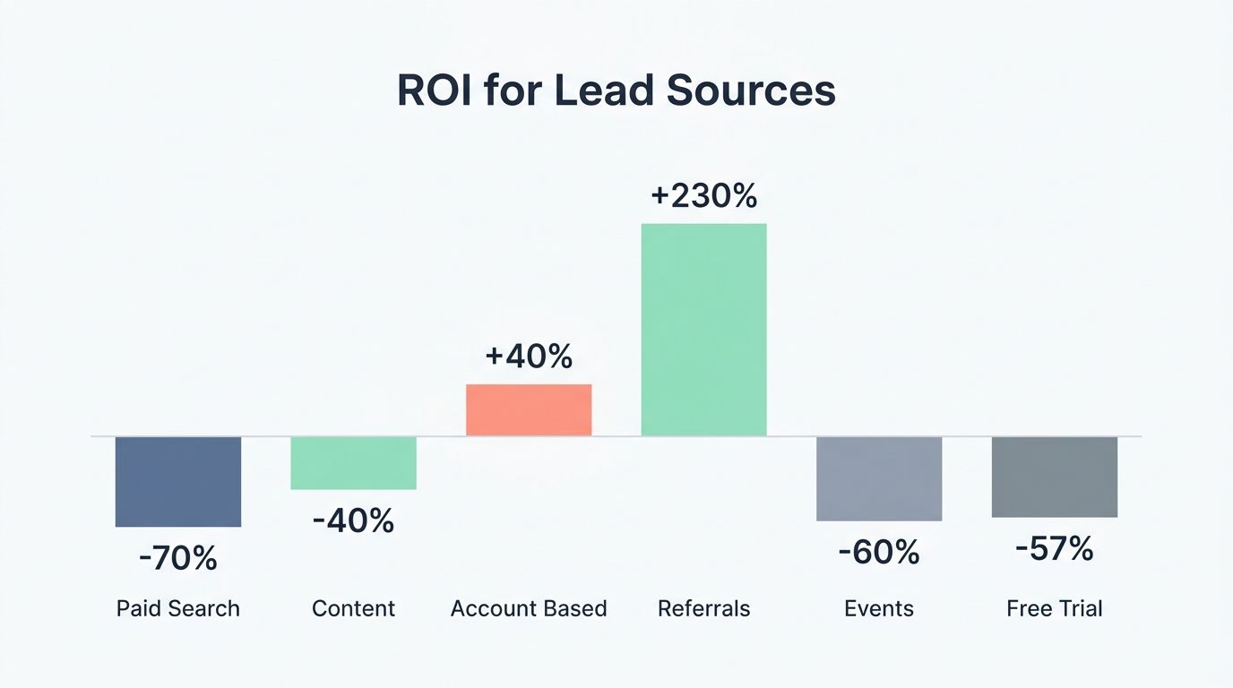
I use ROI by source to stop wasted spend fast. The goal is to compare spend, lead quality, conversion rate, and attributed MRR in one place instead of letting channels defend themselves with isolated metrics.
| Paid Search | Google Ads | $12,000 | 48 | 8% | $3,600 | $1,500 | -70% | +20% | Pause low-intent keywords and scale branded terms |
| Content | Blog + HubSpot | $4,000 | 32 | 12% | $2,400 | $333 | -40% | +6% | Promote posts aimed at buyers with budget authority |
| Account Based | LinkedIn Ads + Outreach | $9,000 | 22 | 36% | $8,640 | $250 | +40% | +83% | Double down on high-fit accounts and add SDR follow-up |
| Referrals | Partner Program | $1,200 | 18 | 44% | $3,960 | $27 | +230% | -10% | Increase partner incentives and measure fit by buyer role |
| Events | Conferences + Salesforce | $15,000 | 60 | 10% | $6,000 | $2,500 | -60% | +50% | Cut booth spend and test executive roundtables |
| Free Trial | Product-Led Growth, Mixpanel | $2,500 | 120 | 3% | $1,080 | $833 | -57% | -8% | Improve onboarding and invite more team-based usage |
| LVR Formula: ((This month’s qualified leads – last month’s qualified leads) / last month’s qualified leads) x 100. If LVR falls for two straight months, I review channel mix and messaging right away. | |||||||||
| Notes: Qualified leads should match your ideal customer profile. Tag lead fit in Salesforce or HubSpot, and review ROI weekly, not just at month-end. | |||||||||
Sales Cycle Length
Sales cycle length measures the time from first meaningful contact to closed-won deal. It affects CAC, forecast accuracy, staffing, and cash flow all at once.
A long cycle is not automatically bad. It is only bad when ACV, expansion, or retention do not justify the extra cost and friction.
HubSpot’s 2025 sales data also showed that 91% of sales teams reported win rates as stable or improving, and 93% said average deal sizes were holding steady or growing. So if your cycle is lengthening while win rates and deal quality are falling, that is a process problem, not just a market excuse.
- Check lead-to-opportunity conversion for qualification issues.
- Check opportunity-to-close rate for demo and objection-handling issues.
- Check time spent in legal or procurement for enterprise friction.
- Check post-demo drop-off for pricing or product-fit gaps.
Engagement Metrics for Product Stickiness

Revenue tells me what happened. Engagement tells me what is about to happen.
Net Promoter Score (NPS)
NPS asks customers how likely they are to recommend your product on a 0 to 10 scale. I calculate it as the percentage of promoters minus the percentage of detractors.
Retently’s 2025 benchmark data put B2B Software and SaaS around an NPS of 41, which is a good directional benchmark for mature operators. I do not obsess over beating the benchmark every quarter, but I do pay attention when a segment falls sharply below it.
The most useful NPS work happens after the score. I slice responses by plan, onboarding age, product area, and account owner, then I connect detractor themes to churn risk and promoter themes to upsell plays.
Daily Active Users (DAU) / Weekly Active Users (WAU)
DAU and WAU show usage frequency, which makes them strong early signals for retention. In many B2B SaaS products, WAU is often the more honest read because the natural usage pattern is weekly, not daily.
Mixpanel’s 2025 benchmark analysis found that only 3% of signed-up users in SaaS businesses ended up subscribing. That is exactly why I care so much about activation and repeat usage, not raw signups.
I keep the event model lean. A small schema such as signup started, onboarding completed, first value event, team invite sent, and weekly core feature used gives me better answers than a giant event library nobody trusts.
- Falling WAU usually points to weakening habit or poor workflow fit.
- Strong DAU but weak expansion can point to weak packaging or monetization.
- High signups and low activation usually mean the funnel promise and first-run experience do not match.
- Healthy usage in admins only can signal poor seat expansion inside the account.
For product stickiness, I want one simple answer every week: which action predicts renewal best, and how fast can I get new accounts to that action?
Final Thoughts
If you want one saas metric to anchor your dashboard, use net revenue retention. It sits right at the center of SaaS unit economics because it connects product value, expansion, churn, and customer success.
Then support it with the metrics that explain movement: monthly recurring revenue, customer acquisition cost, CAC payback, customer lifetime value, gross margin, and engagement.
I would start with a small weekly dashboard, not a giant reporting project. Track the right metrics, review them on a steady cadence, and force every chart to answer one question: what action should the team take next?
That is how metrics that matter turn into better decisions, healthier recurring revenue, and a SaaS business that scales with less guesswork.
FAQs
1. What is the essential unit metric SaaS teams should track?
The revenue per user, or revenue per account, is the essential unit metric. It ties measurement to Profit (economics), and it helps forecast saas renewal.
2. How does this metric differ from different metrics?
Different metrics like churn, CAC, or LTV show parts of the business. Loan-to-value ratio comes from Finance, it matters in lending but less in SaaS.
3. How should a Startup company use the metric?
A Startup company should track it often, even daily if you can. Use it to review metrics, shape product choices, and drive Sustainable development.
4. Do high-performing saas companies and successful saas companies rely on this metric?
Yes, high-performing saas companies treat it as a north star. It sits with other critical metrics, and it tells teams when to scale, or when to tighten the belt.
5. What traps should teams avoid when using metrics?
Do not chase vanity, or make review metrics feel like sadomasochism where numbers punish you. Watch Profit (economics) signals, skip different metrics that do not link to saas renewal, and ask plain measurement questions often.

























 English (US) ·
  French (CA) ·
  French (FR) ·